the politics of usability engineering
A recent class on (web)usability made me understand the political issues behind web-usability. Technically there is little doubt that usability of a software product is the result of applying the usability engineering discipline to the software development process. The earlier the better. But the politial issue behind the technical is to move design authority from business to IT. Right now business controls the design process. They call in the agencies and because of their business knowledge they are considered the experts for usability too.
By establishing usability engineering as a technical discipline (when will we see the engineer for usability?) IT takes over. This is not the only case of the “battle for the web-page”. The move to structured publishing (separation of content and presentation, XML based database publishing etc.) takes away the possibility for HTML and Javascript savvy business users to control the layout of their sub-sites - thereby losing an opportunity to shine in front of company internal competition. Another result of this development is that agencies will have to design layout according to the technical standards of such a publishing system.
The web ain't no MS windows
Especially intranet projects seem to be under constant pressure to look like a windows application. Navigation items don't look like links, lot's of marks to set instead of links to follow.
How to evaluate a page design
Frequently certain page designs where shown and talked about in the class. Some were supposedly good and some not. It occured to me that a static analysis of a page is very hard and also not really reliable. Only when you see how a user works with it the ergonomic quality can be judged. This reminds me of a very special user interface of a data entry application I once helped to develop. The interface was highly optimized for mass data entry and took every opportunity to save on key strokes. Not at all a CUA89 or CUA91 office style interface. The user had to be trained and reached their top speed only after a week or two. The stopwatch proved after that time that the interface indeed saved a lot of money. The problem selling it was that the people who decided about the acquisiton were not the final users and sometimes put off by the “ non-excel ” look.
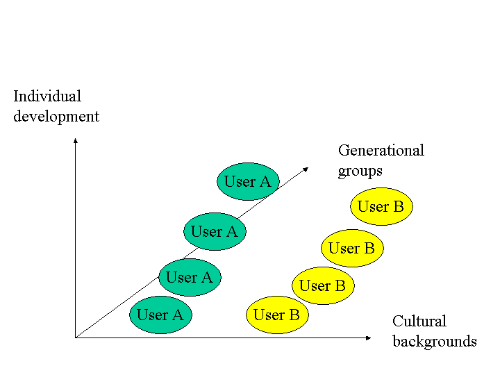
dimensions of a changing user
Usability engineering still reduces the user to a fixed point in time. It disregards the following facts:
-
A user learns how to use an application and will improve if the applications offers different levels of experience. Most applications I know will not lead a user from a novice state to a power user state. If you start using the application through menus and right-mouse clicks you will also end like this. Becoming a power user needs an extra effort up front, e.g. to read a manual and use the keyboard shortcuts from the very beginning.
-
Users belong to different groups with respect to experienc and cultural background Both affect how well metaphors and other GUI design elements will work.
-
And users belong to generational groups. These age groups change with respect to computer literacy over time.

Web-accessibility: not yet
Support for e.g. visually impaired users is still weak. Even usability engineers talk about using colors to make differences “clear”! Navigation requires sight the way it is designed. But accessibilty will become an issue of political correctness. How will a company prove to be an equal opportunity employer if their intranets and internets cannot be used by the handicappeds?
But there is good news as well: the move to XML based publishing will allow companies to add accessibility features easily because page layouts can be generated from XML data and meta-data.
Improving kriha.org
The fact that kriha.org is completely written in XML makes some usability improvements easy to implement.
-
a "download" element added to the website dtd would allow to generate the links for download in different formats automatically. Attibutes would be the supported formats and the download text. The text itself could be taken via ID with fragment identifier pointing to the downloadable document.
-
a sitemap could easily be generated from the navigation meta-data file layout.xml.
-
No italics or serif fonts, smallest font size should be 10pt. Fontsize values of 70 to 80 percent are dangerous. On my Netscape I could not override them. They are specified in a css file.
-
All pages should be printable, without navigation columns. Sounds like a lot of work until you realize that the printable version of each page already exists. It is generated for the text-only version of kriha.org The only thing missing is now a generated link pointing to the text-only page of each tabsite page. The link itself could show up in the footer of each page.
-
The html slide shows used in the lectures tree suffer from two missing links on every slide/page. One link should point to the homepage (if a user has had enough), the other link should lead back to the table of contents for every lecture. Should be easy to generate.
-
make the feedback link context sensitive (page id etc.). Make sure every page has a header too. Why? See below.
-
a search engine needs to be accessible from every page. Generate into header (or footer).
-
Long documents in html format need to be chunked, not only offered in pdf format. Need to use the chunker.xsl.